Today was all about getting started. I had a UI in mind so that’s what I started with implementing with placeholder data.
Good thing about AI tools like ChatGPT is they give you some starting point however its strange how quickly GPT loses context across 2 screens within a new chat. Totally crazy. (It does not do this with text/writing/social media etc. type of chats, only coding.)
Anyways, we’re still early in building Checklistd — the job-search-focused to-do app I’m learning to build in SwiftUI — but even in just a couple of days, I’ve realized something:
You don’t really know SwiftUI until you try styling an app across light and dark mode.
And let me tell you, things that seem like they should “just work”… often don’t.
I guess once I have built tens of apps I would have this down pretty good, but for now small inconsistencies really made me pull my hair out.
The Tab Bar Issues Won’t Go Away
Let’s get this out of the way — I still haven’t cracked the tab bar icon color issue.
I tried .foregroundColor, .renderingMode, using custom assets, and even poking around with UIKit bridges. But those tab icons? Still stubbornly gray in dark mode. I even started reading up on how to build a fully custom tab bar just so I can control every pixel. But that’s a rabbit hole I saves for another day.
Instead, today I focused on building what matters more today — the screens.
Oh btw if you noticed I took inspiration from this website itself for the dark and light mode. (I guess I should thank PaperMod, the Hugo theme I’m using for this website)

What I Built Today (and What I Learned)
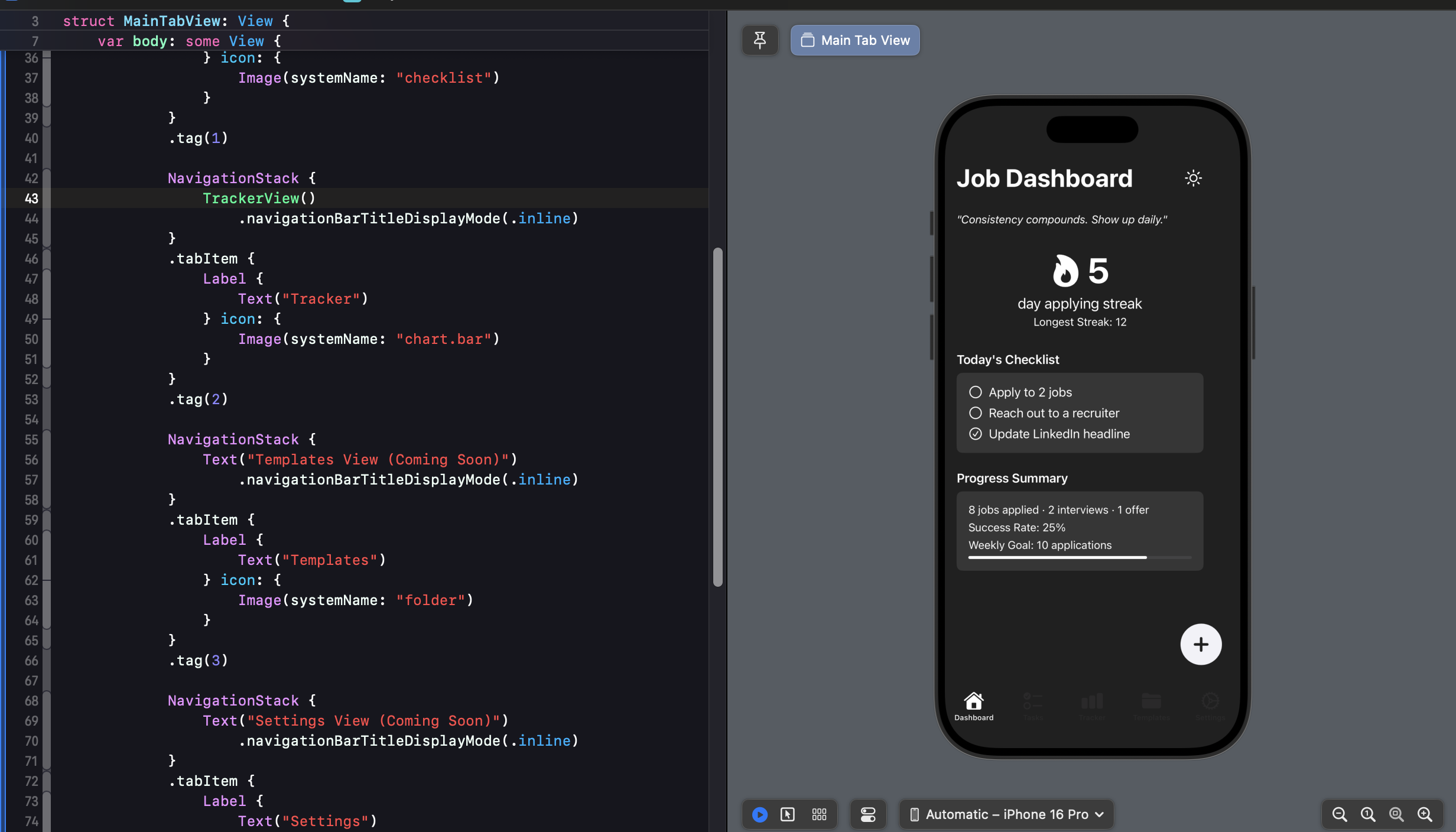
🏠 DashboardView
- Rebuilt the layout in pure black & white, minimalist style.
- Added a streak tracker with a flaming icon that animates.
- Implemented a daily task limit: If you try adding more than 5–6 tasks, it warns you. (Warning about too many tasks in one day end up diluting focus and quality)
- There will be logic in place to move excess tasks to tomorrow (automatically).
- Added a quote of the day and progress bar based on job search goals.
![]()
📋 TasksView
- Made sure the Tasks screen now mirrors Dashboard styling perfectly. (had some issues with some styling elements not rendering the same across screens strangely)
- Added a floating action button.
- The checklist scrolls smoothly now, with nice spacing, toggle logic, and deletions working cleanly.
➕ Add New Task UX
- Built a modal sheet triggered from the “+” button.
- Supports typing a custom task or picking a smart task (like “Apply to job” which suggests subtasks).
- Future idea: Auto-reminder setup after marking some tasks complete. For example: if someone marks an apply task completed, an auto reminder prompt could show up to reach out to recruiter after 2/3 days etc.
🌗 The Never-Ending Struggle with Dark Mode in iOS App
Here’s what didn’t go well:
- Tab bar icons refuse to behave.
- Progress bars looked bad until I tuned color opacity manually.
- Placeholder text wasn’t switching to light color in dark mode.
- App looks great in simulator but light mode background across screens gets treated transparent when build is done in my iPhone. (will pick this up tomorrow)
- Icons rendered incorrectly even after trying
.original,.template,.monochrome.
Eventually, I stopped fighting it and made a note:
🛠 “We’ll build our own tab bar when it’s worth it.”
🔁 Lessons of the Day
- Consistency is everything in SwiftUI. Reuse paddings and color logic or your UI starts drifting fast.
- Dark mode in SwiftUI is not magical — a lot of manual overrides are still required. At least for a newbie like me.
- Building in public helps me catch myself. When you write about what you build, you build better. Plus it helps more since I’m leveraging AI, which means my code is not going to be as robust as a real developer with experience.
That’s it for Day 2.
I’m still a Swift beginner, still figuring it out screen by screen, issue by issue.
But with every view I build, this app feels a little more real.
And someday soon, Checklistd will go from “learning project” to “real app someone actually uses.”
Till then — see you later for Day 3. 🚀